

Mailers, Books,
& Packaging
Designs you can hold (and love).
Award Winning Layouts
Idaho Falls Advertising Federation – GEM Award 2020 :: Star Garnet
Client: Idaho Falls Arts Council
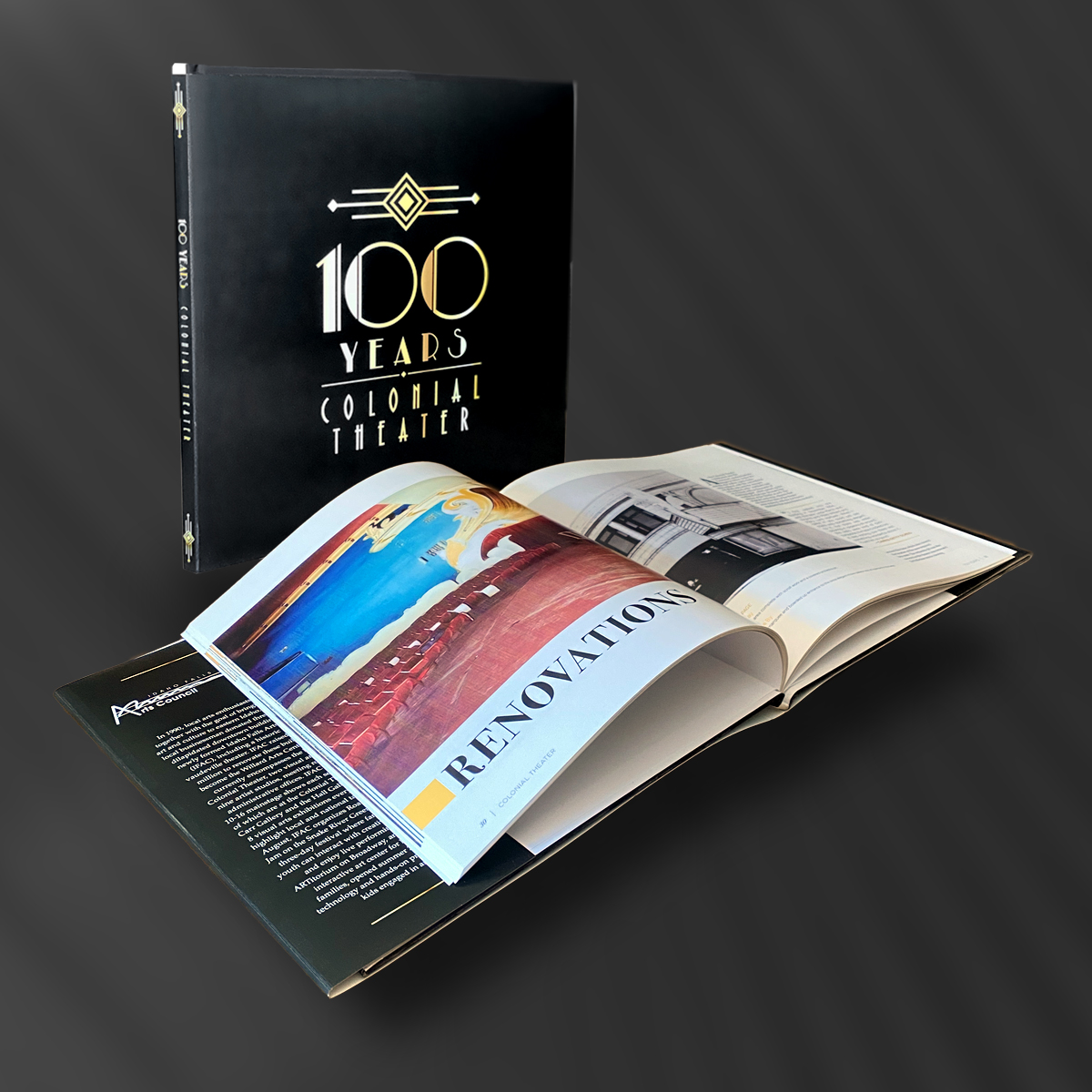
Case Study
Client: Idaho Falls Arts Council
Theme: 100 Years at the Colonial Theater
The Challenge: Celebrating a century of arts and culture at the Colonial Theater, the client wanted a design that balanced elegance with festivity. The goal? Showcase the theater’s rich history with a sleek, black-and-gold palette, keeping it clean and simple but full of celebratory flair.
My Role: Elegance curator. I was tasked with crafting a timeless design that honored the past while capturing the excitement of the milestone. The challenge was creating a visual timeline that was both classy and dynamic..
The Solution: The design leaned into luxurious black backgrounds with gold accents that popped. Clean lines and minimalistic layouts kept the look modern, while subtle celebratory elements, like confetti motifs and shining gold details, added just the right amount of festivity. The timeline was the centerpiece, guiding viewers through 100 years of the theater’s highlights in a visually compelling yet easy-to-follow flow.
Results: The finished design hit the mark—elegant, timeless, and celebratory without being overdone. The event felt like a true celebration of the theater’s history, and the Arts Council loved the polished, refined look that perfectly honored their 100-year journey.
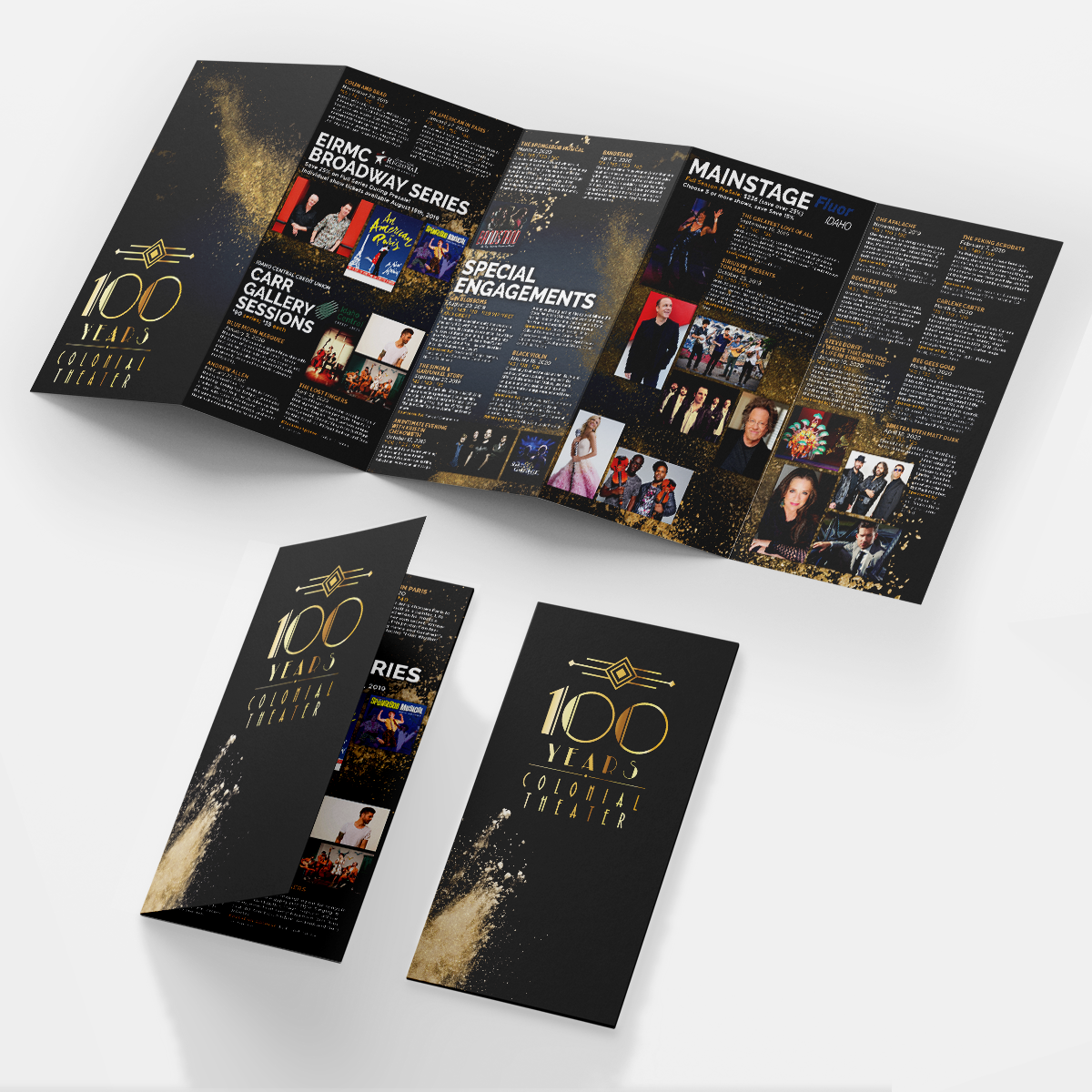
Award Winning Mailer
Idaho Falls Advertising Federation – GEM Award 2018 :: Diamond
Client: Idaho Falls Arts Council
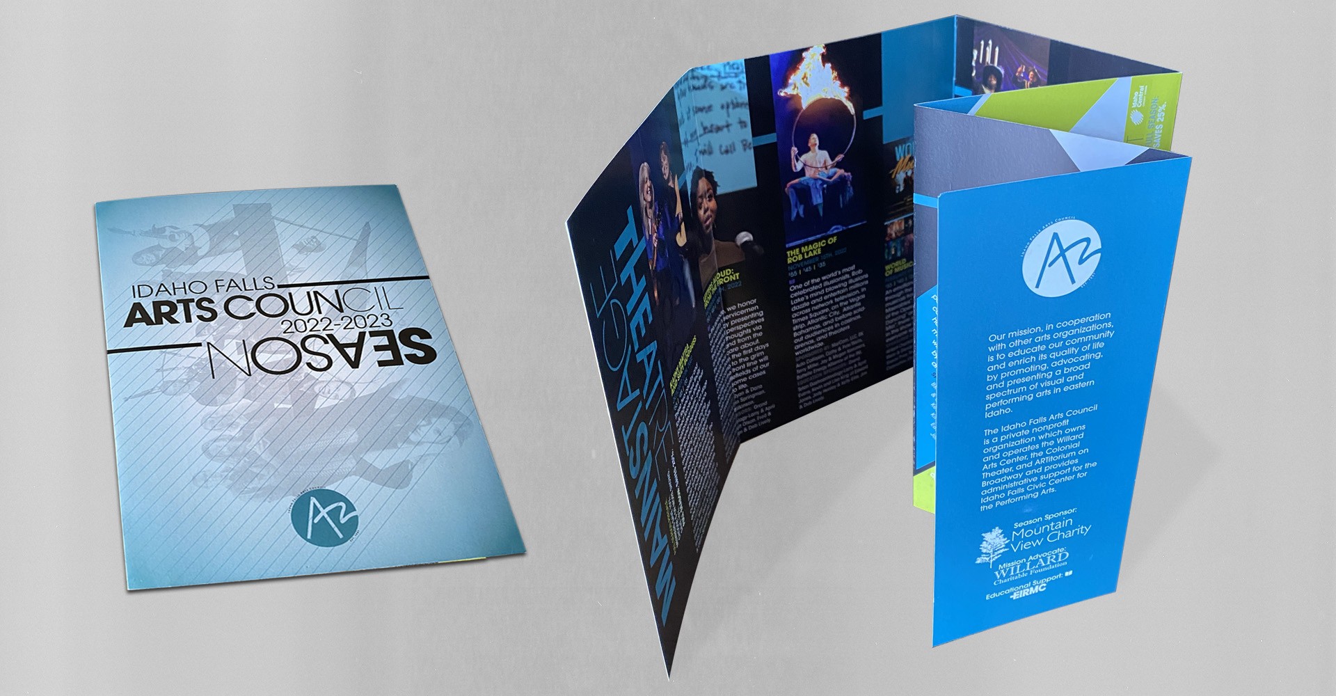
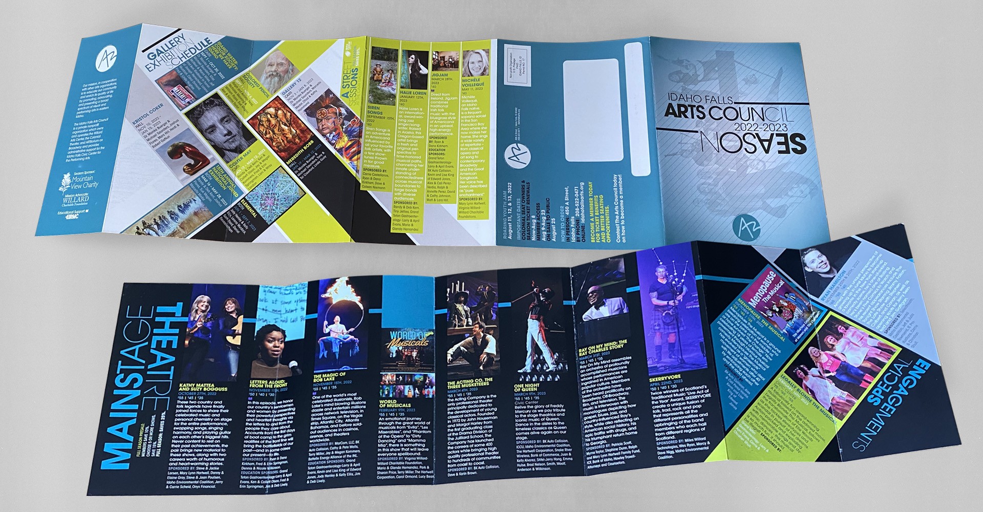
2022-2023 Season Announcement Mailer
:: Idaho Falls Arts Council
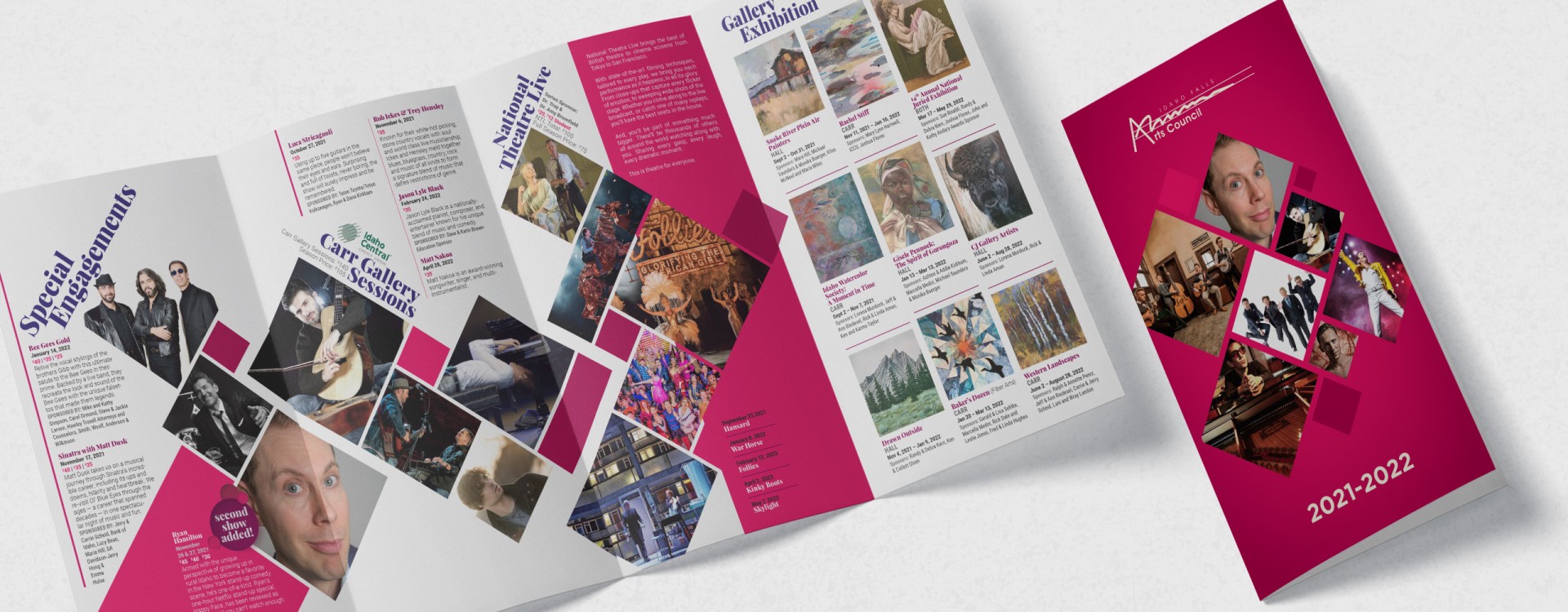
2021-2022 Season Announcement Mailer
:: Idaho Falls Arts Council
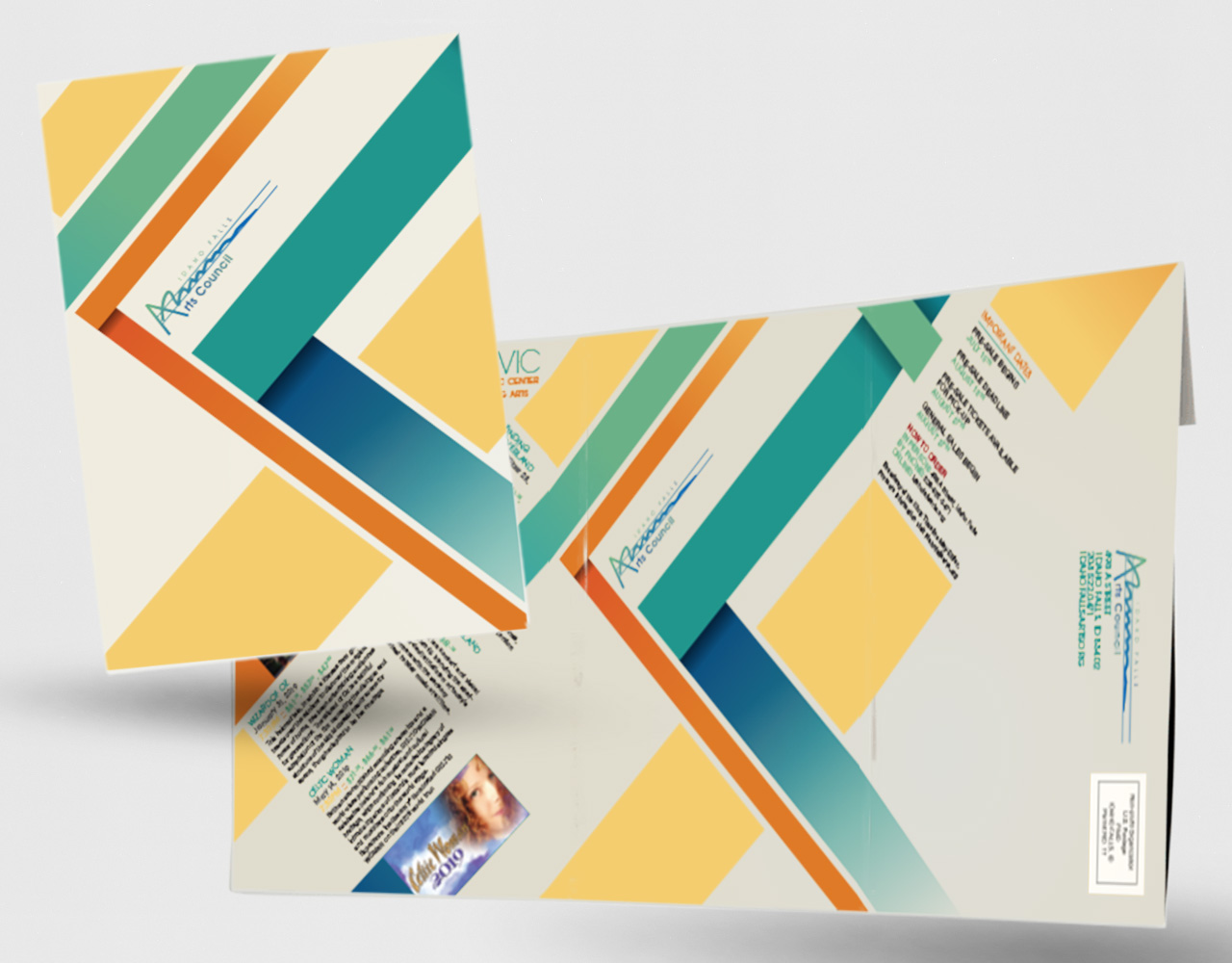
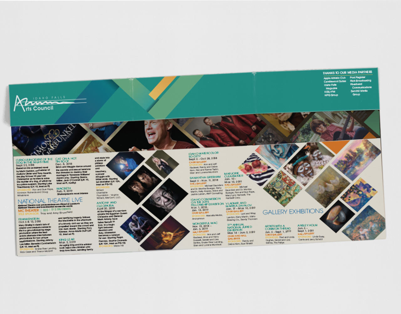
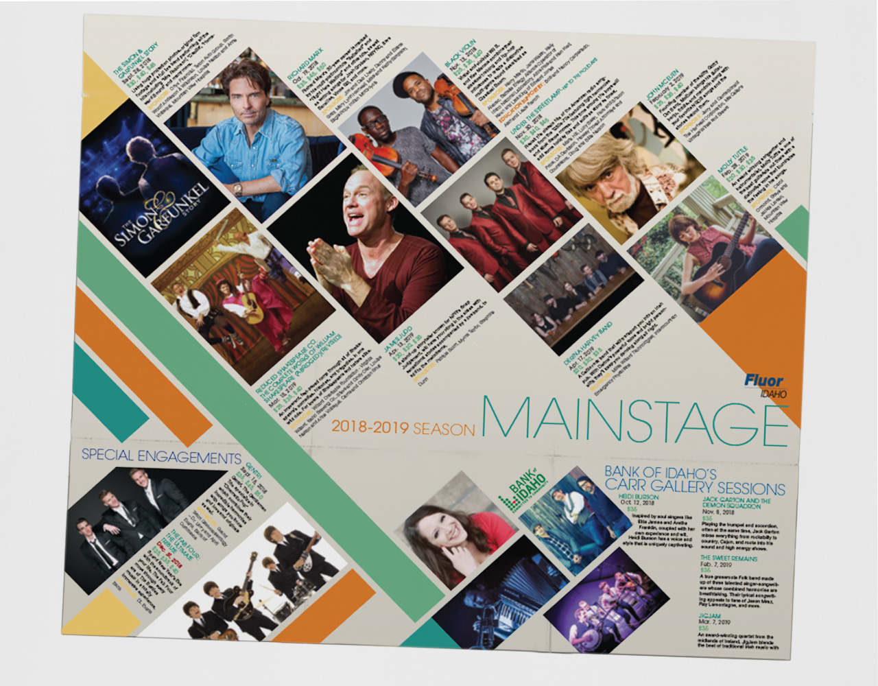
2018-2019 Season Announcement Mailer
:: Idaho Falls Arts Council
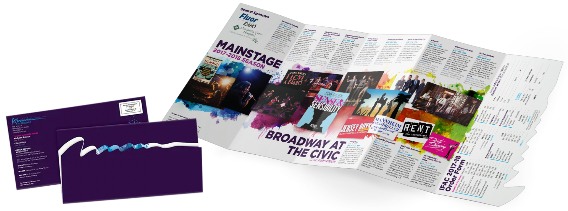
Case Study
Client: Idaho Falls Arts Council
Theme: Event Line-up Announcement
The Challenge: Design a yearly mailer to showcase the event lineup, with each year bringing a fresh, artsy look. The challenge was to create bold, creative layouts–something recipients would want to keep on their fridge–that not only captured attention but also set the tone for the Arts Council’s entire marketing and advertising for the year. The mailer had to be both a piece of art and the blueprint for the year’s promotional materials.
My Role: Design trendsetter. My job was to craft a unique, playful, and visually striking mailer that would influence the overall branding for the season, while staying true to the Arts Council’s mission of celebrating the arts.
The Solution: Each mailer was treated like a canvas. One year might be bright and abstract with splashes of color, while another was more refined with quirky, angled elements. Every design balanced creativity with clarity, making sure the lineup was easy to read but packed with personality. Playful typography and art-inspired layouts kept the design lively and unpredictable—just like the events themselves.
Results: The mailers became a hit, adding excitement for the upcoming season. People looked forward to seeing what new artsy design would arrive each year, making the lineup itself a part of the fun. Attendance grew, and the Arts Council loved the fresh, dynamic approach.
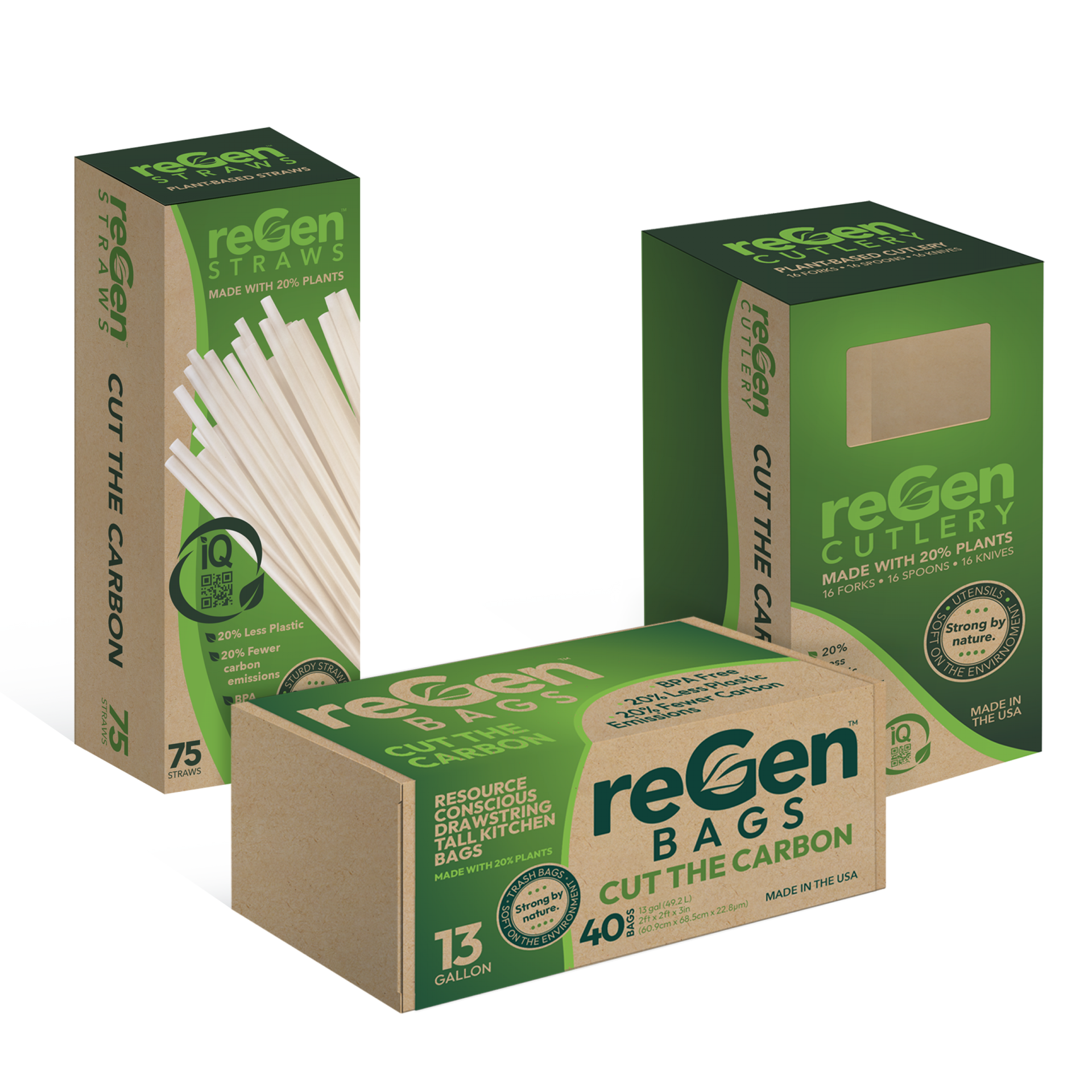
What's In The Box?
reGen Packaging
Client: BioLogiq
Thumbing Through The Years
15 years in magazine production. Gaze into the glory of smooth, glossy print.
Love it?Get In Touch